Customised Embroidery Designs
As our foray into the wonderful world of embroidery continues, we thought that a blog outlining some of the trials and tribulations of embroidery designs might help people when deciding on how to maximise the quality of their embroidered logos and on which garment they are best suited. Having seen some beautifully crafted embroidered designs, logos and art pieces, as well as some absolutely horrendous ones, we have come to the conclusion that you, the customer, and not our advanced technological machines coupled with our keen eye, are directly responsible for your terrible embroidery results. Clearly the above criticism is in jest, we certainly don't blame or valued customer for their results, however, we have learned that there are many contributing factors when it comes to maximising the quality of your embroidered designs.
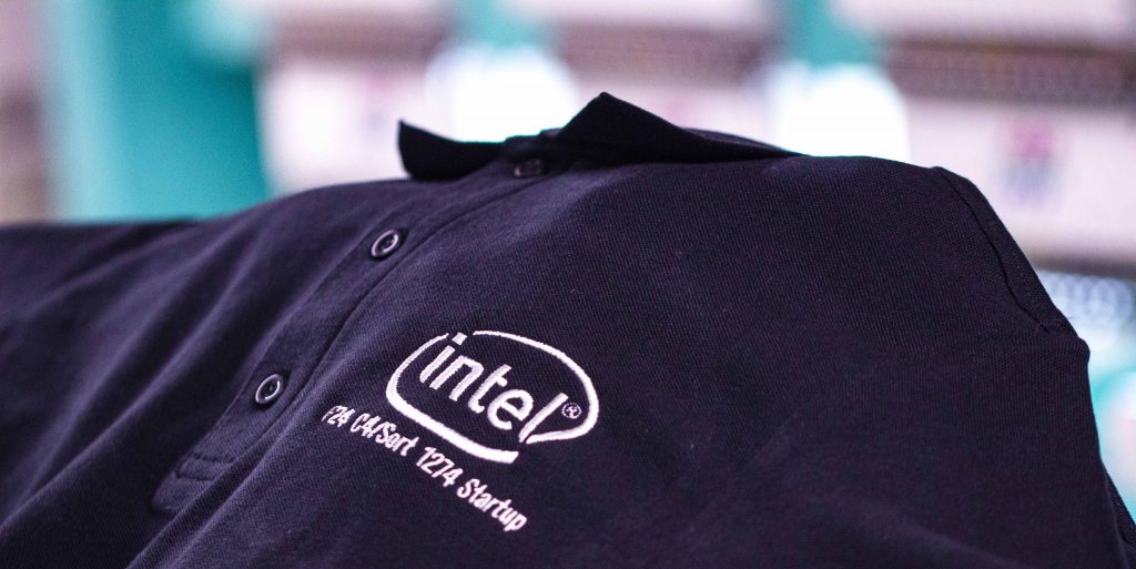
 Embroidery design Intel
The Embroidered design itself
If a design or logo looks crap in and of itself, no amount of technology or T-shirt Company mastery can do much to fix it and that my friend, lies with you. Naturally, we will highlight this to you in a very gentle way and guide you toward something better. The first lesson is the higher the quality of the design the higher the quality of the finished embroidered article. The quality of the file of the embroidered design is also key when it comes to extracting the maximum definition to convert into an embroidery disc. If the file is a very low-resolution small-sized PNG or jpeg it will limit the quality the of the conversion and the sharpness of the logo will be affected and will detract from the quality of the finished article.
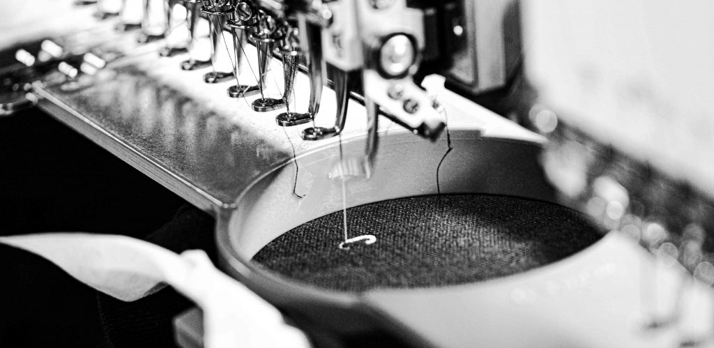
 Detailed embroidery design process
The size of the embroidery design
Occasionally we get requests from customers that wish to have their designs embroidered in very small dimensions. this is generally inspired by labels such as Lacoste (crocodile), Ralph Lauren (The man on a horse playing polo) or Penguin (A Penguin, surprisingly). Unfortunately, many people have difficulty accepting that these logos are extremely simple in design and having these embroidered in small sizes is ok as there is no detail to maintain when shrinking them down. When it comes to detailed colourful logos though, the golden rule is the bigger it is the more detailed it will be and the smaller it is the more it has to be squashed in, text will become less sharp and overall, if it is a detailed logo it is going to look less sharp and more crowded. If your logo has a lot going on in it, the best way to get a good result is by keeping it big.
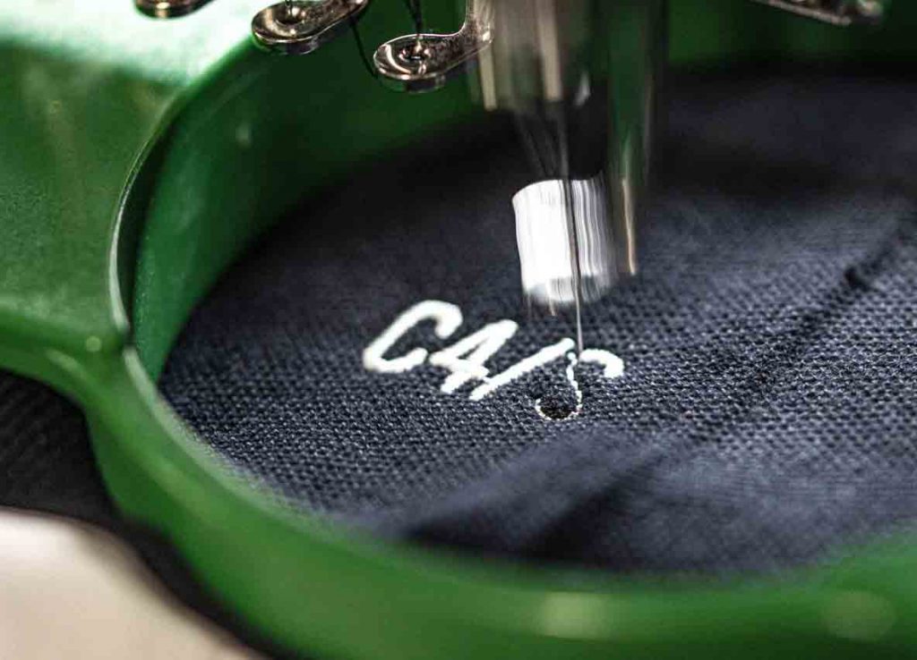
 Close up embroidered design
Text and embroidery
When it comes to text only logos, embroidery can be tricky, particularly when it comes to thin text. Embroidered designs increase in quality generally when there is a large number of stitches in them and when it comes to thin text that is going on a limited sized canvas, they are generally a low number of stitches which can make thin sharp-lined text look almost jaggedy. Bold fonts provide less problems. How this will be affected is also based on the fabric that is being embroidered. More solid canvasses such as softshell jackets and sweatshirts/hoodies will have more of a pull that will be able to take a thinner text. Beanies and tshirts on the hand, provide a softer canvass that without sufficient pull in the fabric distort thin text
As you can see from the above, when it comes to embroidery design there is much to consider to ensure you achieve the highest quality stitching, if you have any questions at all, drop us an email to info@tshirtcompany.ie
